At Slingshot, we believe “beauty and functionality shouldn’t be afterthoughts.” What happens if you decide to skip out on a Design phase, and move straight into Development? If your product is built without the user’s experience in mind, you’ll end up with a confusing and hard-to-use product.
By taking time to make sure your product is simple and usable, you’ll enhance your product’s longevity and effectiveness. How do you successfully undergo a Design phase, why it’s important, and what happens if you skip? We’re glad you asked!
Summary
A design phase is completed to ensure your product is easy to use and has a thought-out flow. Steps can include user flows, wireframe development, UI design, clickable prototype development, and user testing.
Having a design phase before development allows you to visualize what you’re building (as opposed to just conceptualizing.) You’ll also be able to reduce the risk of your product being difficult to use, and verify those results with user testing. Another bonus is that you can iterate very quickly and cheaply in the phase, as you’re making changes to screens as images as opposed to code and architecture.
What’s involved in a Design phase?
Slingshot has been creating software for over 16 years, but we haven’t always had a Design phase. After years of trial and error, we’ve incorporated design to better enhance what we’re building for our clients.
1 – User Flows
This step is our transition from Research to Design; Just like middle school science class, these first procedures follow the scientific method. We’ll craft what we expect to happen, and tie those expectations to business goals. From these assumptions, we can create User Flows. There are several different ways a user can interact with your product. A User Flow is a visual representation of the many paths that can be taken. By mapping these out early, you can ensure that all possible user needs will be designed and developed.

2 – Wireframes
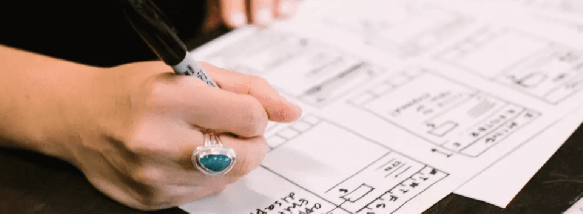
Design has to start somewhere – and this is it! After we’ve explored User Flows, we move into Wireframing. These are sketched first-attempts at how a screen should be structured, and are meant to provide the big picture of the User Experience, or UX (as opposed to colors/fonts/etc.).
This will not be a full-blown design, as the purpose is to outline features, flows, and foundations. While it’s not as exciting as ‘real’ design, it’s certainly necessary to build a foundation.
3 – User Interface (UI) Design
This is where the ‘real’ design comes in; at least, what you probably think of when you think of design. We create what the interface will look like based on the wireframes. Colors, Logos, and Fonts, oh my!
4 – Clickable Prototype
Before we move into User Testing, we’ll need to create an experience we can test with real users. We start by transitioning the UI we’ve designed into a clickable prototype. As it sounds, it’s an interactive mockup that allows users to click on, and navigate between screens. There’s no code, so we can quickly and cheaply iterate through the design.
5 – User Testing
No matter the years of experience or amount of data used, User Testing is a crucial step in ensuring your design is simple, usable, and understood as intended. We’ll take the aforementioned clickable prototype, and share it with potential future users.
It’s important to keep track of features and screens that are confusing or difficult to understand. That way, they can be updated in the next iteration of design. We’ll iterate on said designs until they are simple and easy to use. By the time we officially start coding, we could be on the 3rd or 4th iteration (as opposed to the first one).
Why is Design important?
We get this question often: why should we undergo a Design phase before Development starts? While it does add time and cost up-front prior to coding, it’s important to see the benefits of having an explicit design phase.
Visuals vs Concepts
You may think you know what you want your software to do or look like, but you won’t truly know if that works until you see it laid out. This is why wireframes are so necessary; by seeing what the foundation looks like, you’ll be able to understand if the concepts you’ve been dreaming of are accurate. A lot of times, designs pivot after evaluating the wireframes, and we come up with new ideas that wouldn’t have been uncovered without them.
Not just Pretty Art
Of course, that’s part of it; it is called design for a reason. But it’s more than matching a button to your brand’s colors. There is quite a bit of science and testing involved within a design phase. Just because it looks good doesn’t mean it’s easy to use. This allows us to build a product that’s based on true data as opposed to what we think ‘looks good.’
Verify Results and Reduce Risk
When you undergo a Design phase that includes User Testing, you’ll be able to move into Development with verified results that clearly show your app is easy to use and hits the mark with your user base.
It’s also important to point out that by verifying said results, you’ll be reducing risk severely. With iterative design, you’ll have fixed mistakes or problems that wouldn’t have been addressed if you only designed once. This means that as you start building, you won’t have to worry about extensive changes. If there’s any, they’ll be minimal.
Why is this important? Because any changes you make once Development has started get exponentially more expensive, difficult, and time intensive the longer you wait to make them. We talk about this in depth in our Time vs Cost of development blog.
Fairly Quick
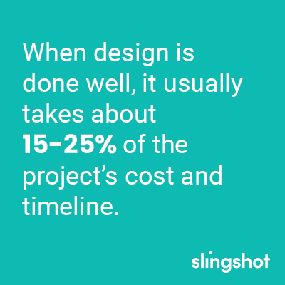
If you’ve developed tech before, you know that it can take months or even years (depending on how intricate/crazy it is) to build a product. At Slingshot, the general rule of thumb is that when design is done well, it usually takes about 15-25% of the project’s cost and timeline.
There’s certainly a reward for doing your homework upfront; you’ll be more likely to ace the test (of customers approval)!

What happens if you skip Design?
While we’ve gone on and on about the positives of a Design phase, you may still not be convinced you need to do one.
So let’s switch it up and discuss the negatives of skipping design; what happens if you decide to move straight into development?
Your Product Won’t be Pretty
Of course in the grand scheme of things, something not being pretty isn’t the death knell for an app (sorry, designers!) However, it’s still important to keep your branding in mind; any app or product you develop is an extension of your brand or company.
When you skip utilizing a designer, software engineers will be the ones to pick up the slack. While there’s nothing inherently wrong with this, design isn’t their specialty. When you approach design as an afterthought, functionality becomes more important than usability. This means that you may miss super important pieces that you need to engage your users.
Kiss Usability Goodbye
Just because your app functions correctly doesn’t mean it’ll be usable; when you throw UX design out the window, you’re tossing your user’s experience along with it. An app that doesn’t have direct design worked into it can be clunky to navigate, awkward to use, and extremely confusing.
When your app is not easy to use, your customers will go elsewhere. You don’t want to make them overthink. Because people want a seamless and straightforward experience. When there’s a million other things to worry about (besides a frustrating app), your product will fall off.

Higher Risk, More Rework
If doing design lowers your risk, skipping design will raise it. When you miss out on the User Testing you’d get if you did design, then the first time users experience your product is at the very end of development. As we mentioned earlier, this is the riskiest time to make changes, as the foundation is set and any changes now will be exponentially expensive. While it’s not certain that you’ll have to rework things, why risk paying multiple thousands of dollars when you can avoid the risk and pay way less upfront?
What are we doing, again?
Again, when skipping User Testing, you’re missing out on a lot of valuable insights and opportunities to richly engage with your users. Another point you’ll wish you had is knowing if your product actually addresses the problem. When you don’t have user input, you can only assume your product is filling a need for your customers.
You’ll also have issues moving forward with your MVP, as skipping design will increase the chances that your features are not helpful, and that other key features are missed. Unnecessary features mean bloat, and bloat means more resources and less simplicity. All in all, you’ll be creating a bad user experience.
Conclusion
At Slingshot, we believe all great projects incorporate a well thought-out Design phase.
A Design phase helps ensure your app does what you want it to, is a good representation of your brand, and helps reduce risk in the long run. Not to mention it’s fairly quick when compared to how long Development will last.
If you’re still not convinced and skip design, you’re much more likely to build an unappealing, hard-to-use product that will require lots of rework at a risky and expensive point in Development. And you won’t necessarily know if you’re addressing the problem correctly until it’s too late.
Whether you see yourself as an artist who loves to explore the possibilities of design, or a business-person who wants to build a clean and simple app, you’ll only be able to reach those goals via an upfront design phase.
So grab your pens – it’s time to doodle!


